Table of Contents
Preface
Whether you’re an omnichannel retailer or a D2C company, you must have put a lot of effort and money into your marketing campaigns to get online users to buy from you. But if they abandon your cart, all your effort and marketing money will go to waste. It’s interesting to note here that 69.57% of online shopping carts get abandoned. To optimize your site’s or app’s conversion, you need to get inspired by some of the leading checkout page designs and know the best practices of designing such a page for your own business. This post can act as your guide in these matters and then offer some more.
Introduction
A good checkout page design can significantly contribute to the success of your online store. When judging a business’s credibility, 75% of people focus on how its website looks, while 6 out of 10 people believe website usability to be extremely important when shopping online. Even if you have an excellent product, your business will experience poor conversions if your website looks bad and is difficult to use. And since the objective of an e-commerce website is to get as many conversions as possible, a crucial area of focus should be the design of its checkout page. Whether you’re planning to take your business online for the first time or want to give it a makeover to boost conversions, this list of the 25 best checkout page designs of 2022, along with a few other crucial pointers, will help inspire you to take the right path to get the job done properly. But before diving into the list, here are a few things you should focus on.
Brand snippet
If you’re looking to design the world’s fastest checkout page, Xpresslane is your one-stop-shop. With Xpresslane, you can let your customers shop with a single click right from the product page of their choice, and that too in less than five seconds. For new users, you can ensure 60% faster checkout than typical e-commerce websites that ask first-time users to complete at least 14 to 15 steps.
What Is a Checkout Page?
The checkout page of an e-commerce store is the page(s) where customers make payments and can see their shipping/billing details. This is the page where customers need to enter their payment details to complete their order. From collecting a customer’s billing details, shipping details, payment and shipping method to giving him/her a choice to submit the order, the checkout process involves them all.
Best Practices Before Designing Your Own Checkout Page
Checkout page best practices are a group of guidelines, tips, and strategies to create efficient checkout pages. These best practices can help optimize your checkout page to reduce checkout abandonment and improve conversions. However, there’s no one-size-fits-all solution for checkout page designs because your online store and experiences are unique to your business and target audience. Thus, you should use these best practices when picking from multiple pre-existing checkout page templates to identify the most vital elements for designing your own checkout page.
Here are the key checkout page best practices you should keep in mind:
-
Allow guest checkout
Shoppers don’t want to get stalled just because they’re asked to register first and are taken to sign-up forms that ask for a lot of details. Since friction is the enemy of sales and slowing down the shoppers by forcing them to sign up could make them abandon their shopping carts, it always pays to allow guest checkouts by just asking for their email address and phone number. You may even allow sign-ins via social logins through Facebook or Google accounts to ensure a smooth and fast checkout process.
-
Focus on mobile-friendly design
Mobile commerce volume is anticipated to rise to 44% of e-commerce by 2024, primarily driven by smartphones and tablets. This makes it crucial for you to prioritize a mobile-friendly checkout page design to ensure it’s uniform and seamless for all users across all types of devices.
-
Offer a range of payment modes
Having multiple payment methods and accepting multiple currencies will encourage a growing number of customers to complete their purchases. Your checkout page design should ideally begin with the major providers to ensure most customers can use a payment method of their choice. Over time, you can add more payment options and currencies as your business grows, and it becomes feasible to have such options.
-
Include security seals and trust symbols
To let your shoppers know your website is a secure place to do business, you should prominently display security seals, badges, and trust symbols. All these will build confidence in your shoppers as they’ll know their personal and financial details are safe with you. This will persuade them to complete their purchases from your online store.
-
Display a progress indicator
Your shoppers should be able to notice the stage of the checkout process they’re on, in addition to seeing the total number of steps the entire checkout process has. This will give them a fair idea of how far they’re in the process, how much longer it will take, and even give them a sense of accomplishment as they finish one step after the other and notice the progress indicator moving. Though such an indicator is beneficial for complex and multi-step checkout processes, some single-page checkouts too can employ them to make it simpler for their customers to follow along and see all the steps they’ll need to complete at once.
-
Remove or restrict distractions as much as you can
Your checkout process should be clear, clean, and have limited distractions. From removing the usual header and footer, menu options, and buttons that can be distracting to using autocomplete and data validation (along with error notification), offering one-click express checkouts, and letting customers use their billing address for shipping are some effective ways of keeping the customers focused on their shopping and ensuring they proceed to the end of your conversion funnel.
-
Display cart contents and the option to edit them
Your checkout page should show the purchase details (like size, color, quantity, price, etc.) to help the customers review their orders. It should also let them make changes – be it adding more items, deleting a few, moving some items to the wishlist, or saving some for a future purchase.
-
Draw attention to benefits and support options
Things like free shipping and returns or a discounted price during festivals or holidays should be highlighted on your checkout page to give your potential customers the final nudge to go through with their purchase. Displaying links to FAQs, privacy policy, shipping details, and return and refunds are also effective in building trust and showing business transparency. You should ideally highlight a phone number or live chat option (if you offer any) in your checkout design as they can help customers get answers to their pre-sales questions or seek help midway through the checkout process.
-
Keep on testing
Even when you design the best checkout page possible, you can’t guarantee how your target customers will respond to it. Instead of making guesses, you should run A/B tests regularly to check how one or two modifications to your checkout page design work and notice what changes can make your shoppers more willing to buy from you.
Few Checkout Page Examples That Might Inspire
While some of these checkout page designs have multiple things going in favor of them (such as Amazon), some others score on a specific point or two (say, Build.com). We bring you the top 25 contenders below that we think can inspire you and even serve as your checkout page examples to follow. You may consider the following as your checkout page templates and change the specifications based on your offerings and brand style.
-
Amazon
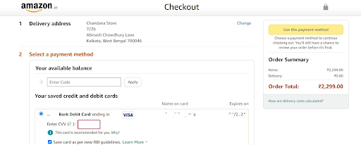
From adding products to your shopping cart to confirming your payment details, everything’s a breeze with Amazon’s checkout page design. After you add a product to your cart, Amazon will alert you at the top of the page by summarizing your pre-checkout order by showing the product’s name and image, quantity, and the total price payable. Once you land on the checkout page, Amazon condenses all of the constituent elements of your order into a single, uncluttered page. Here, you can review your delivery address, payment details, the product(s), and the expected delivery date – all in a single glance. For logged-in customers, the entire checkout process can be completed with a solitary click or two steps as most of their details are saved.
Making mobile checkout a hassle-free affair is another thing that works in favor of Amazon. It even gives buyers a pictorial depiction of their purchase process (as below) to show how far they’re from the product’s ownership, thus encouraging them to finish the last step.

Image: https://makewebbetter.com/blog/ecommerce-checkout-flow/
-
Flipkart
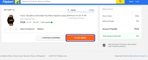
Image: https://www.customercarephonenumber.in/blog/how-to-placed-order-from-flipkart-com/
Once, Flipkart was India’s king of e-commerce stores. Though Amazon has raced miles ahead of it, you can still get checkout page inspiration from Flipkart. With its 4-step checkout process that includes sign-up or login, submitting or confirming your delivery address, reviewing the order summary, and choosing the payment option to complete the buying process, Flipkart makes it all easy for both new and old users. Its assurance of safe and secure payments, 100% authentic products, and easy returns on the checkout page work as added charms for buyers to go ahead and finish their checkout.
-
Best Buy
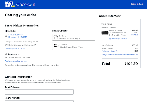
If you’re looking for checkout page examples that spell simplicity, Best Buy can be your go-to guide. It simply asks for your contact and shipment (or store pickup) information before letting you proceed to the payment page. You can either sign in if you’re a returning customer or continue as a guest by submitting your email and phone number (as shown above) before proceeding with the payment process.
-
Apple
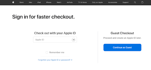
Apple’s checkout page is extremely well organized and utilizes white spaces properly to attract users’ attention to the CTA (call-to-action) buttons. While registered users of Apple can sign into their respective accounts to complete the checkout process, guest checkout lets shoppers go ahead with the option of creating an Apple Id later. With straightforward and interactive checkout steps, both logged-in and guest users can complete their purchases easily. In case they need any help mid-way, they can use the ‘chat now’ or ‘call’ option to reach a representative of Apple and get their queries answered.
-
Disney
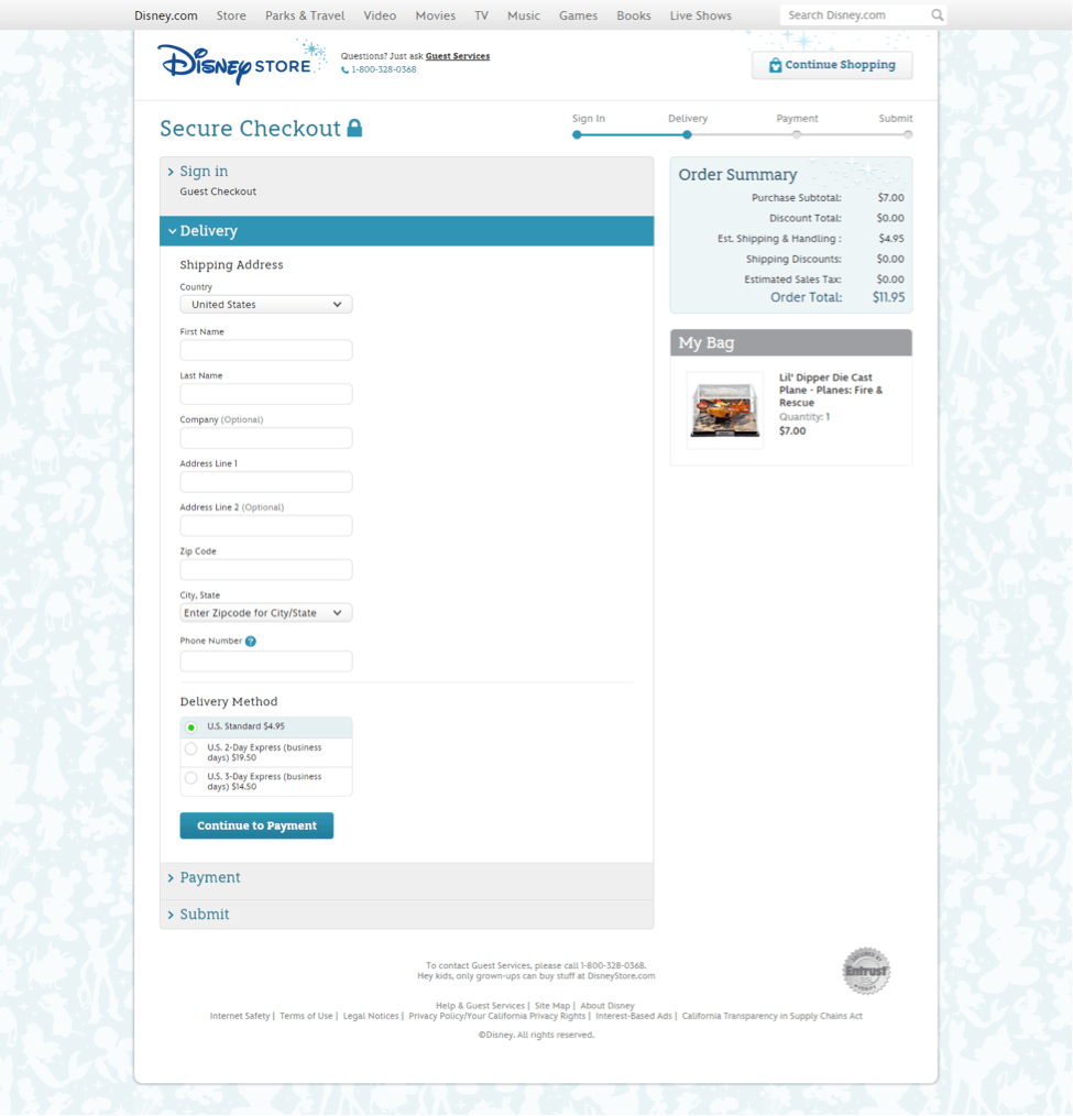
Buyers love to get multiple payment options. However, they dislike hidden, extra and undisclosed, or surprise charges – be it sales tax, shipping costs, gift wrapping charges, or convenience fees. They prefer all the extra charges to be declared upfront, which is exactly what Disney does. Its clean checkout process displays different shipping times and related costs, thus letting users choose their preferred shipping time and seeing the adjusted total price of their purchase in real-time. With such transparency, Disney enjoys higher levels of its customers’ trust. Disney also offers multiple payment options – from regular credit and debit cards to PayPal, Disney Gift Cards, and Disney Rewards Cards.
-
Nike
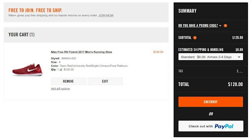
Image: https://siliconithub.com/best-examples-of-ecommerce-checkout-pages/
Typically, checkout page best practices emphasize speed and security as two of the main concerns that e-commerce businesses should focus upon. Nike ticks both these boxes. Its checkout page design lets users checkout with PayPal. Thus, shoppers with a PayPal account don’t need to log in separately as they can log in to their PayPal account to move ahead to the next step of the checkout process. Those without a PayPal account can opt for the regular checkout interface that has a partial on-page checkout where you’ll need to finish the first step to unlock the succeeding one. With a clearly visible ‘remove’ button, Nike’s checkout page also lets you easily delete products you don’t want.
-
Adidas
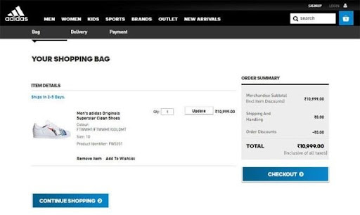
Image: https://prisync.com/blog/6-reasons-for-cart-abandonment-and-how-to-fix-them/
Checkout page best practices demand that all probable distractions are removed from the user’s path to let the individual focus on completing the purchase. Not sure how to do this? You can get checkout page inspiration from Adidas that has a short, simple, and self-contained checkout process. There’s no disturbing pop-up requesting the users for their opinions on some vague topic, no navigation bar to take them away to some other section of the website, and no ads (third-party or internal) to interfere with the purchase.
-
ASOS
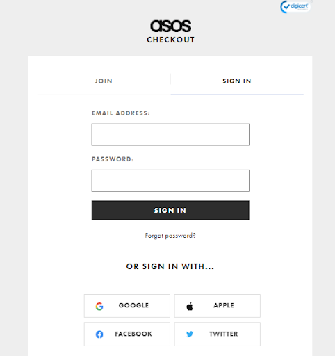
ASOS lets you sign in/register or go ahead as a guest to complete the checkout process.
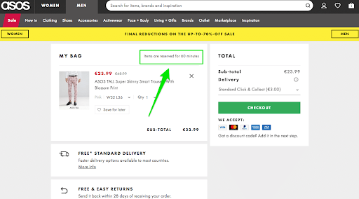
Image: https://www.growcode.com/blog/shopping-cart/
With neatly segregated sections for adding a promo code, your email, reviewing the details of products ordered, submitting the delivery address (or choosing from the click and collect options) and mode of delivery (low-cost or fast), among others, ASOS’s checkout page design has drilled down the entire process to a fine art. The page also mentions that the products you’ve added to the cart will be reserved for 60 minutes to make your shopping experience easier.
-
Myntra
Though Myntra’s multi-page checkout doesn’t offer guest checkout, it’s still pretty conversion-friendly as shoppers can continue with their purchase by using their Facebook or Google account to shop as registered users instead of guest customers. With the progress bar on top, you can clearly see how far you’re in the buying process. With logos of multiple payment options displayed over the footer and an online payment security seal, the checkout page design of Myntra gives confidence to the shoppers.
-
Walmart
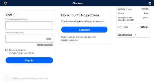
Image: https://prisync.com/blog/6-reasons-for-cart-abandonment-and-how-to-fix-them/
For a seamless, easy, and quick checkout, several retailers allow new users the option of guest checkout. Potential buyers who don’t want to register with the website right away or even registered users who have forgotten their credentials can use this option without abandoning the checkout process. That’s what Walmart does, which can serve as your checkout page inspiration. Walmart also gives customers two delivery options – you can either submit a shipping address or pick the ordered product from a nearby shop. Either of these choices has minimal forms that are easy to navigate and include a 3-step process.
Image: https://www.ecomm-guru.com/7-best-ecommerce-checkout-examples-for-2021/
-
Etsy
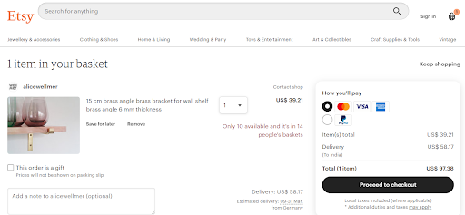
Image: https://www.ecomm-guru.com/7-best-ecommerce-checkout-examples-for-2021/
Etsy lets you proceed with the checkout as a guest without registering an account with it. Thanks to its clutter-free interface, understanding and proceeding with its easy step-by-step checkout process is a breeze. With multiple payment options on offer, choosing your preferred mode is also made simple.
-
Nordstrom
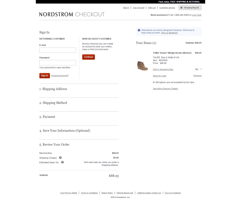
Image: https://www.ecomm-guru.com/7-best-ecommerce-checkout-examples-for-2021/
It boasts of an extremely minimal and tidy checkout that has two steps. The first involves the customers filling out their contact and shipping details, while the next deals with the payment process. By displaying the shipping options clearly, Nordstrom makes it quite easy for its customers to choose the proper shipping form for delivery.
-
Zappos
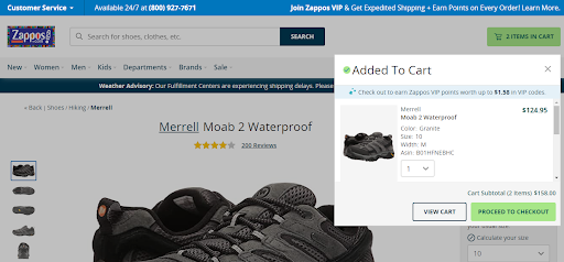
Image: https://www.ecomm-guru.com/7-best-ecommerce-checkout-examples-for-2021/
Despite being a little long, what works in favor of this checkout page is its simplistic design that consists of a step-by-step method to take the shoppers through every step. Shoppers can either sign into their existing account or sign up for a new account to enjoy a smooth and straightforward shopping experience.
-
AliExpress
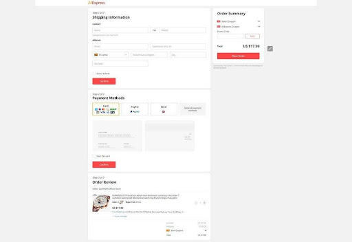
Image: https://ecommercebooth.com/best-examples-of-ecommerce-checkout-pages/
Though shoppers need to register before they can proceed to checkout, this site’s 3-step checkout process with multiple payment options highlighted with logos and the ability to edit and customize orders even in the last step seal the deal. After your first purchase, the site saves your payment and shipping information, and shows the checkout page as a pop-up window on your successive purchases to let you finish the buying process in minimal steps.
-
BigBasket
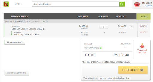
This online grocery store that serves the Indian market has an extremely clean checkout page. You can easily select the products to add them to your cart and apply vouchers, if you have any, directly from the checkout page. With multiple payment options and delivery time slots to choose from, along with the amount you have saved being displayed prominently, shopping for groceries online has been streamlined by BigBasket’s checkout page design.
Big Basket’s subtle upselling and cross-selling by displaying product categories under ‘Missed Something?’ (as shown above) also work well for customers.
-
Urban Outfitters
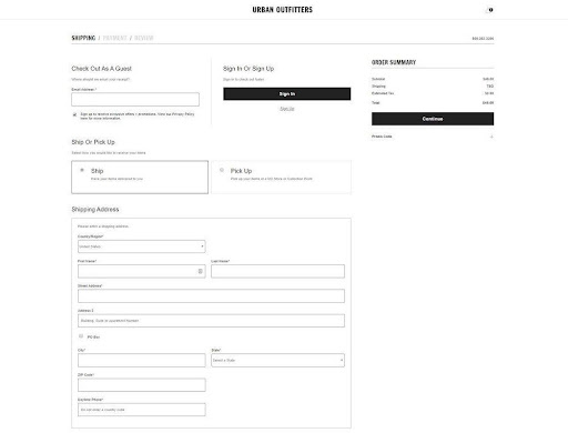
Image: https://ecommercebooth.com/best-examples-of-ecommerce-checkout-pages/
This checkout page design bears a resemblance to Walmart’s. You can get your chosen products delivered to your address or pick them up from the nearest store. This site’s checkout page involves a 3-step process. The first two collect a customer’s contact information and payment details, respectively, while the last and final step lets the shopper review his/her order before paying for it.
-
Bellroy
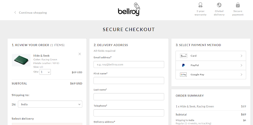
Image: https://www.ecomm-guru.com/7-best-ecommerce-checkout-examples-for-2021/
With its single-page checkout design, Bellroy makes it quicker and easier for its customers to enjoy a user-friendly shopping experience. You can submit your delivery address, payment and billing details, and shopping options on the same page without moving out, which saves your time and effort.
-
Crocs
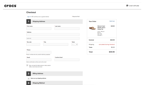
Image: https://compozio.com/conversion-rate-optimization-challenge
Crocs ticks multiple pointers related to the checkout page best practices. From easy-to-see order details (including shipping costs and taxes) to the option of signing in or continuing as a guest user, knowing the number of steps involved in the checkout process, the ability to edit cart contents, and live chat option – all make it an ideal case to get inspiration from when looking for checkout page design ideas or checkout page templates.
-
Simply Hike
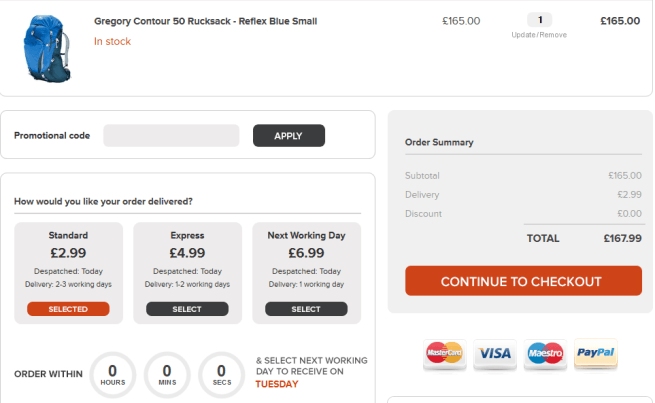
Image: https://ecommerce-platforms.com/ecommerce-selling-advice/12-e-commerce-sites-inspirational-checkouts
What works for this site’s checkout page design is the multiple shipping and payment options on offer. You can take your pick from three shipping options – Standard, Express, and Next Working Day, and pay the charges accordingly. With multiple payment modes like PayPal and credit card (Visa, MasterCard, and Maestro), cart abandonment is minimized due to customers not finding their preferred payment options.
-
Cutter & Buck
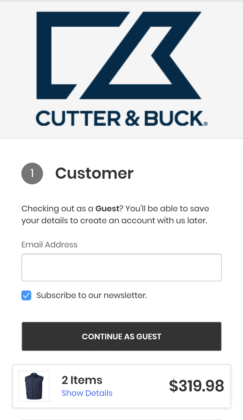
Image: https://blog.contactpigeon.com/mobile-checkout-best-practices/
Cutter & Buck inspires with its minimalist and easy-to-navigate mobile checkout page design. Apart from its appealing vertical orientation that’s sure to entice mobile shoppers, it also facilitates instant checkout for them as guests, if they desire. With a 4-step checkout process, customers can get through it all in next to no time.
-
Build.com
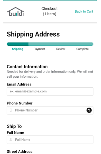
Image: https://blog.contactpigeon.com/mobile-checkout-best-practices/
This website impresses with its speedy checkout process while encouraging larger purchases. Apart from its mobile-friendly checkout, it also offers multiple and quick product recommendations to encourage consumers to stick to its app a little more without getting distracted. And while it prompts extra purchases, Build.com manages to keep the checkout process a breeze. It lets shoppers add the extra items, apply coupon codes, and finish the process easily with Amazon Pay or PayPal.
-
Crate & Barrel
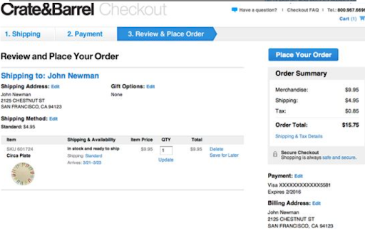
Image: https://in.pinterest.com/pin/38421403043155320/
Good checkout page designs let sellers upsell and cross-sell so that their shoppers don’t forget about the original product(s) they were purchasing. An interesting checkout page inspiration in this field is what Crate & Barrel does. Unlike others that position their products for cross-selling on the product page itself, this website includes them inside the cart, thus making them unmissable for the shopper. Crate & Barrel also boasts of a clean guest checkout/sign-in page. By letting guest users create an account after they have completed their purchase, it gives them an unobtrusive shopping experience and wins some brownie points from us.
-
B&H Photo
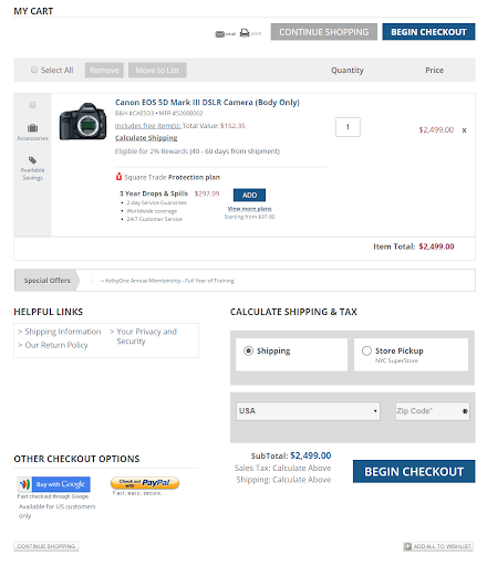
Image: https://staging-wp.optimonk.com/10-impressive-ecommerce-shopping-cart-design-examples-online/
This website lets shoppers proceed either as registered users or guest users by choosing PayPal checkout or express checkout. Some of the checkout page best practices it follows are transparent product information, easy addition or deletion of items in the cart, links to shipping and return policy, and hassle-free ways to seek customer support (via live chat, customer care number etc). By enticing customers to buy add-ons, the ‘add’ button on the checkout page helps extend the shopping experience.
-
REI
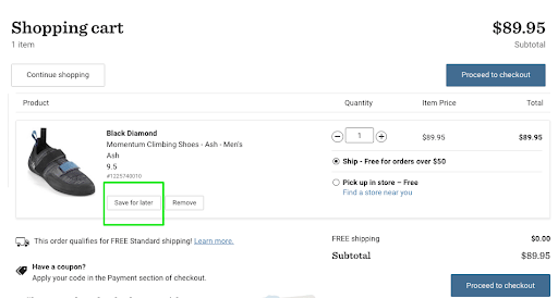
Image: https://www.growcode.com/blog/shopping-cart/
If you need checkout page examples to understand how to keep it simple and clutter-free, REI could be your ideal case to study and learn. With a clear checkout page design where you can see and review your order details (product’s name, image, quantity, price, and shipping cost), it makes the entire shopping experience fun and fast. Highlighting free shipping, where applicable, twice on the same page is a clever ploy by REI to entice customers. It also lets users save products for later, which can act as an impetus to visit the website again in future to complete their purchase.
-
Godiva
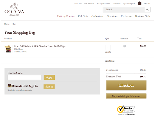
Image: https://staging-wp.optimonk.com/10-impressive-ecommerce-shopping-cart-design-examples-online/
Godiva’s checkout page design is simple with the use of three colors – dark brown, white, and gold for text, background, and buttons, respectively. With a logical and user-friendly layout, the page looks stylish. The option to ship the product(s) to either a solitary or multiple addresses is another helpful feature on offer.
Checkout Page Design Templates to Develop on Your Own
If you’re creating your online store and checkout page on a hosted platform, you’ll get a handful of pre-made templates that you can customize to suit your business. In case you plan to choose a self-hosted platform, you can search for e-commerce themes from different marketplaces, such as TemplateMonster, ThemeForest, and Colorlib.
Here are three checkout page templates for you to consider:
-
Ella – Multipurpose Shopify Sections Theme
Image: https://themeforest.net/item/ella-responsive-shopify-template/9691007
It’s a multipurpose Shopify theme that comes with
- Over 22 eye-catching home page and skin layouts
- 9+ layouts choices for the category page
- 16+ beautiful child themes
- 12+ layouts options for the product page
- 99+ flexible and customizable content blocks
- Added features like support for 3D models, mega menu layouts, multiple headers and footers, etc.
-
Foodly – One-Stop Food Shopify Theme
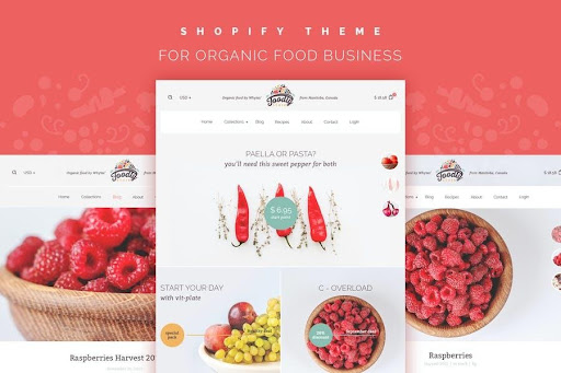
Image: https://elements.envato.com/foodly-one-stop-shopify-grocery-shop-UGCYFA
Grocery food stores or organic food sellers can use this checkout page template with a responsive design. It offers
- Superb UI/UX
- Ease of editing
- Mobile- and SEO-friendliness
- Megamenu (3 options)
- Notification button with discount/promo message
- Social media integration features like Facebook Chat, Instagram feed, and share buttons
- Mailchimp integration
- Stylized default emails
This is the fastest checkout page on our website. Click here to know more!!
-
Nella Fashion Shop WooCommerce Theme
If you want to design an e-commerce store for jewelry, fashion, electronics, sports, spa, beauty, or furniture, this responsive theme could be your go-to solution. Some of its features are
- Mutil-menu style
- Creation of your own dynamic sidebar (right, left, or none)
- Custom menu color
- Multi-home page layout
- Integration of Woocommerce catalog mode
- Shop style list and grid
- Custom header/footer for specific page
- 40+ styles grid post
Closing Thoughts
Your checkout page design is the heart of your online store. It’s the last thing your visitors will interact with before they decide to become customers – or not. With the checkout page best practices, examples, and templates, you’re likely to have adequate inspiration to create your own checkout page that works effectively.
FAQs
How do I make a good checkout page?
You can create a good checkout page by prioritizing a mobile-friendly design, allowing guest checkouts, limiting distractions for shoppers, offering multiple payment options, displaying trust seals and badges, and using a shopping progress indicator. Additionally, you should draw attention to benefits and support options, and conduct continuous testing to enhance your customers’ shopping experience.
How do I create a checkout page in WooCommerce?
First, you should go to Pages > Add New. After ensuring the editor is in visual mode, you need to click the One Page Checkout icon. Next, you should click inside the Products field followed by typing the product name(s) you want to display. Choose the products to display and the template you want to use for product selection fields. Then click Create Shortcode. You can add content below or above the One Page Checkout shortcode in the editor to display your terms and conditions, sales copy, or other content above or below the product selection and checkout form.
How do I build a checkout page in Shopify?
You can use the Shopify app and go to Store > Settings, after which you should tap Checkout to manage, edit, or customize your checkout page (such as its style, checkout form options, checkout language, store policies, etc).
How do I build a checkout page in WordPress?
You can use the WooCommerce plugin, which contains all the essential e-commerce platform elements, to create a checkout page in WordPress easily and quickly.
How do you make a checkout flow?
You can make the checkout process quicker by simplifying the information collected, offering guest checkout and social logins, using autofilling and real-time validation, employing a checkout progress indicator, prioritizing mobile user experiences, summarizing order details and cart content while allowing easy editing options, and using visuals for a seamless and simplified process.
What should a checkout page have?
A checkout page should collect information that’s absolutely essential, be mobile-friendly, eliminate unnecessary distraction for shoppers and have a clean, simplified design, offer multiple payment modes, feature security seals and trust badges, remove surprise costs and fees, use error notifications and form validation, auto-save cart contents, and make it easy to reach customer support.
Reduce Cart abandonment using Xpresslane.